A data-informed overhaul of a beloved Chicago garden retailer's website.
Context
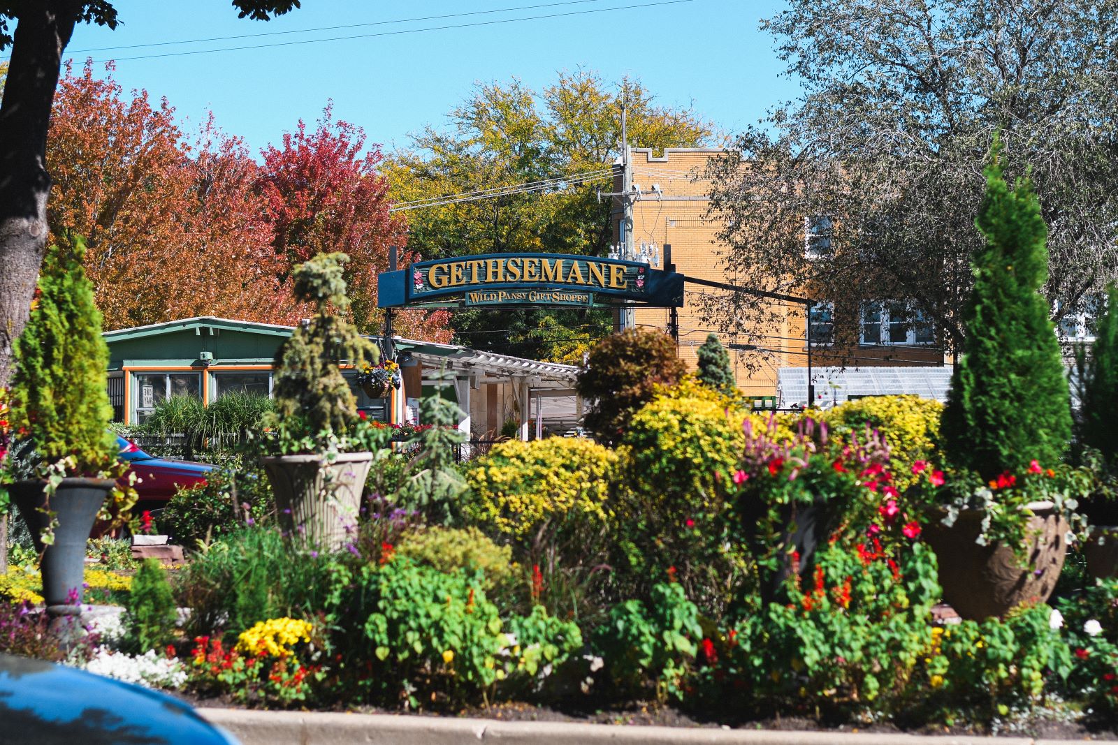
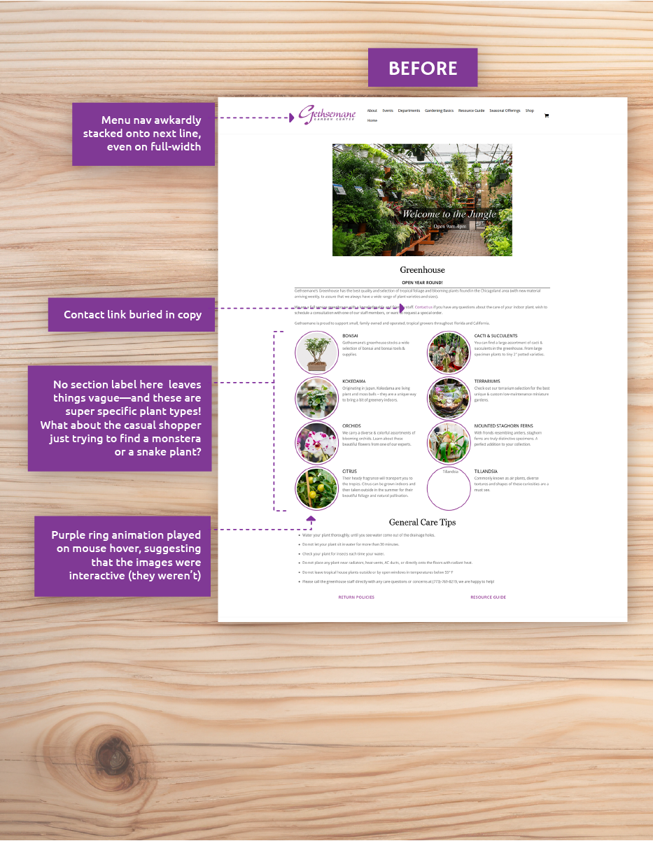
Gethsemane Garden Center has been a beloved institution of Chicago's Andersonville neighborhood since 1977—but its web presence has lagged a bit behind the times. Slow load times, clunky navigation, and lots of text to sift through.
My goal: bring the site up to speed with the business it represents. I restructured the site's information architecture, redesigned its interface, fine-tuned performance, and added search functionality. Six months later: gift certificate sales were up 15% (a reliable, core sales metric for the business), site traffic was growing, and customers were finally saying, “This feels like Gethsemane.”
Behind the scenes, we untangled WordPress plugin bloat, streamlined for mobile, and introduced a fresh brand voice that is equal parts expert and neighborly. Here’s how we went from “Whoa, that’s a lot of information…” to “I found exactly what I needed in seconds.”
My Role
▸
UX Research and Web Design
usability testing, information architecture, Wordpress
implementation, SEO
▸
Visual Design and Branding
color, typography, imagery, tone, copywriting, illustration
1. Understanding the Problem
Gethsemane's website hosts a ton of great gardening resources, but it
was buried beneath confusing site architecture, slow page speeds, and
no usable search.
User testing confirmed these hunches:
Plus, average user testers (around 35 years old) told us:
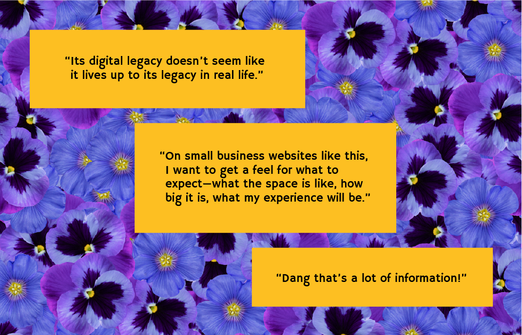
- There’s an overwhelming amount of text—no way to scan or find what they came for.
- They wanted clear examples (“What plants do you actually sell? How easy are they to care for?”).
- Clickable elements weren’t obvious—some images looked tappable but weren’t, and mobile links weren’t highlighted.
- Email newsletter calls-to-action lacked context—no incentive to sign up.
- They craved images of the physical space and product offerings (“Is that what the greenhouse looks like?”).
- They’d skip navigation entirely if a reliable search could get them to the right page faster.
In short: Gethsemane’s website didn’t reflect its offerings accurately, or make it easy to find the info that users wanted.
2. Research & Insights
Before sketching anything, I dove into research to avoid guesswork. Since no analytics existed, I set up basic visitor and search tracking and ran a full heuristic evaluation. Then I conducted:
- User Interviews & Testing (10 participants, avg. age 35; skews female 50+). We observed frustration with reading huge blocks of text and unclear navigation.
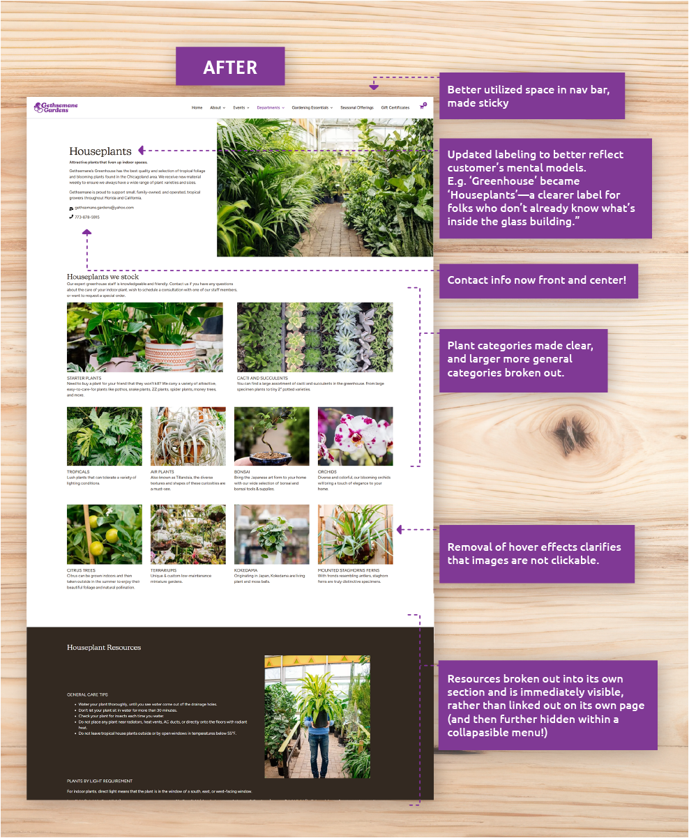
- Card Sorting to uncover how people think about plant categories. Our findings led to a new hierarchy: people expect “Herbs & Veg” rather than “Edibles,” “Houseplants” rather than “Greenhouse.” and "Home Decor" over "GC Home".
- Competitive & Heuristic Analysis of five local/national garden retailers. They all featured clear product pages, FAQs that mapped to top customer questions, consistent visual branding—and a search bar that actually worked.
Key Insights:
- People want to see “What you carry” before “How to care for it.”
- Labeling must match everyday language and customer mental models (e.g., “Home Décor” instead of “GC Home”).
- Mobile experience was lacking—users bounced when they saw walls of text that didn’t fit their screens.
- Since e-commerce potential is limited, we needed to spotlight workshop and gift certificate purchases (a stable revenue stream) up front.
3. Strategy & Design
Armed with those insights, I sketched a plan to reorganize content, redesign visuals, implement a robust search, and optimize performance—while celebrating that signature pansy mascot and Andersonville charm. Here’s how:
3.1 Information Architecture & Content
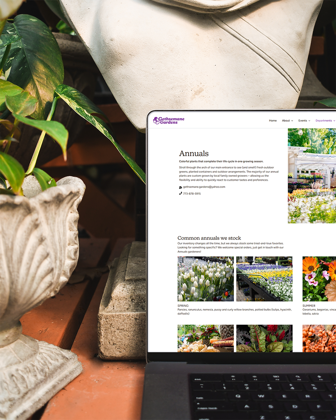
The biggest win: improving content scannability and organizing it to more closely match user mental models, as well as providing alternative paths to content. In practice, this meant:
- Introduced consistent hierarchy of scale across all pages, including clear section headers and labels to make scanning easier.
- Introduced "FAQ" and "Services" pages, common ways users might try to figure out if we deliver, or whether we offer garden design services.
- Removed one long “Resources” page; shifted plant-care guides into the relevant department pages.
3.2 Visual Design & Branding
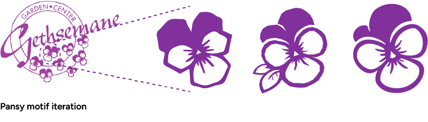
Next, we needed a look and feel that felt both trustworthy and fun—just like Gethsemane in person. This ended up being part of a larger branding overhaul where I refreshed the logo and established official brand guidelines.
Pansy Polishing: Revamped the pansy mascot so
it appears more polished and scalable, anchoring the brand
across pages.
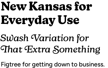
Display Typeface: New Kansas (designed
by Miles Newlyn, a modern take on Cooper Black). The rounded
serifs and playful swashes echo the pansy’s warmth while
retaining classic roots.
Body Typeface: Figtree (clean sans
serif for longer text passages).
Updated Logo: Integrated pansy into wordmark
and improved logo legibility at distance.
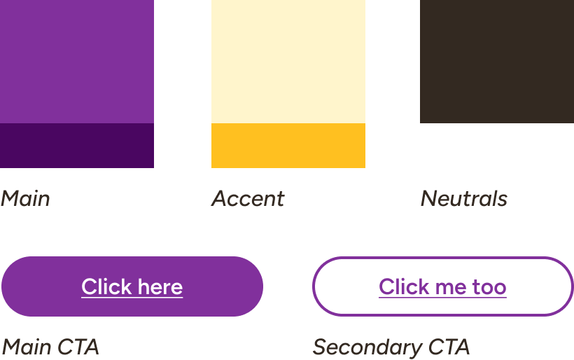
Color Palette: Slimmed down version of the full
palette, with the core Pansy purple supported by warm yellows,
browns, and neutrals.
3.3 Search & Navigation

Since our users were eager to bypass navigation, we reintroduced a search bar—this time with sensible query limits so it actually returned useful results. Specifically, we:
- Built a custom search query that prioritized product pages, department pages, and key operational info (hours, location, workshop details).
- Filtered out irrelevant content (e.g., archived blog posts) so users don’t get lost in outdated pages.
- Placed the search box prominently in the header so it’s available on every page.
4. Implementation & Results
Between August and October 2024, we moved from “What is this site even?” to “I found it instantly!”—all while keeping a tight budget (under $150 for a staging plugin). Here’s what happened after launch:
4.1 Technical Rollout
- Deployed updated theme and custom CSS/JS on staging, ran
user-acceptance tests with the owner and marketing team.
- Addressed plugin conflicts: disabled two heavy gallery plugins,
replaced them with lightweight JavaScript carousels.
- Launched in mid-October; monitored performance logs and error
reports daily for the first two weeks.
4.2 Business & UX Impact
- Gift Certificate Sales: +15% in the first six
months (compared November 2023–May 2024 vs. November 2024–May
2025).
- Overall Web Traffic: +30% year over year, driven
by better SEO (added descriptive metadata and alt tags) and faster
load times.
- Load Time Reduction: From 3.2s to 1.8s on average
(mobile and desktop, per Lighthouse reports).
- Search Usage: 20% of users bypassed navigation
entirely and found relevant pages via search within five seconds.
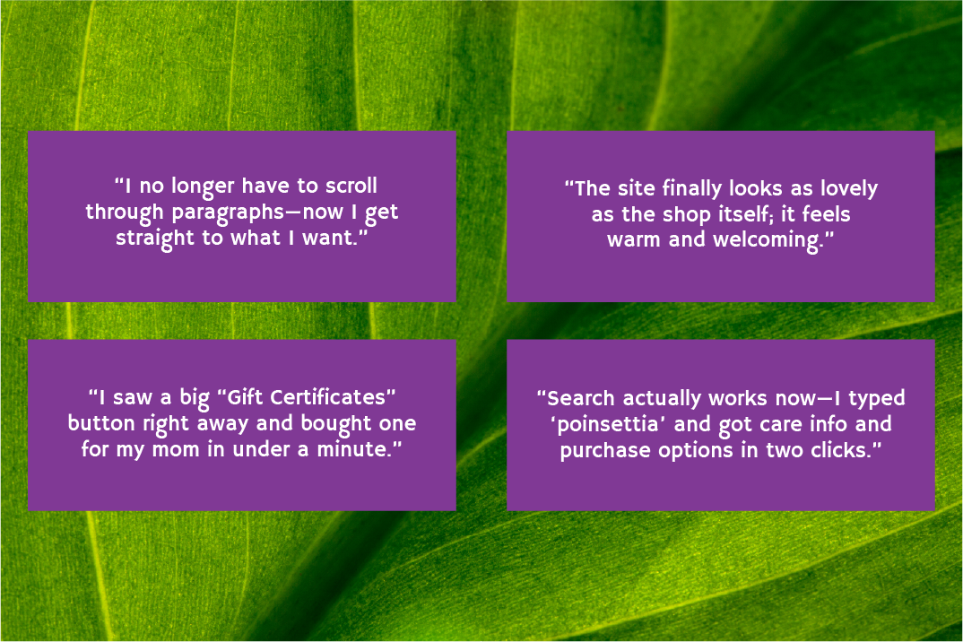
4.3 Customer Feedback
Here's what folks were saying once they got their hands on the new site:
5. Learnings & Next Steps
This project reinforced a few guiding principles:
- Remember Customer's Mental Model Organizing Information Architecture helped users navigate quickly and sensibly.
- Search as a Lifeline: A reliable search bar boosts usability dramatically—users will skip navigation if they can type and go.
- WordPress Realities: Ecosystem plugins can be powerful but can also slow you down. I learned to pick lightweight alternatives and consolidate custom code where possible.
- Plan for Iteration: Gethsemane’s needs will evolve seasonally. We built a foundation that’s flexible: update workshop dates easily, swap seasonal photography, and add new events without a full redesign.